Flexbox
The flexbox is one method we can use to start to create dynamic (flexible) layouts, grids, and compositions on our web pages. A flexbox has two basic parts: the flex container and flex items. We can turn any element into a flex container by giving it the property:
Any elements contained within this element (its children) will be considered flex items. Using flexbox, we can exercise greater control over the position, behavior, and alignment of the elements contained inside. Flex items can also be given display:flex; and will become flex containers themselves, allowing us to nest dynamic containers within dynamic containers.
For the purpose of this tutorial, we’ll just be focusing on the properties of the flex container and we’ll be referencing this guide:
After going through the guide, let’s practice some more by recreating this image using flexbox:
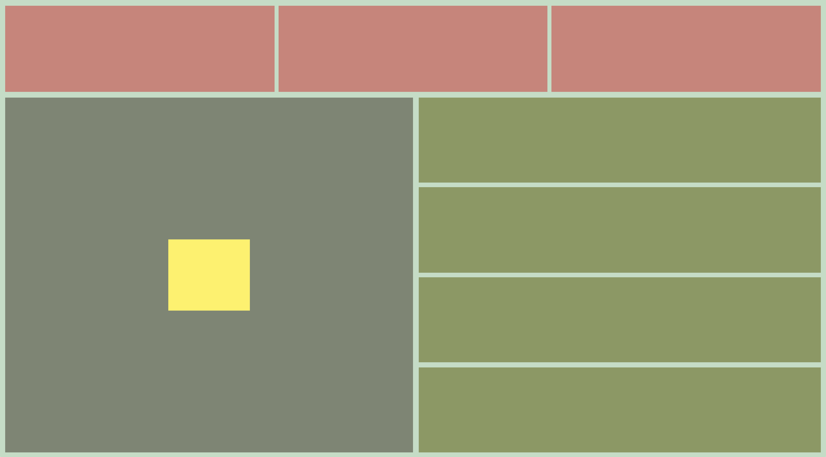
Before beginning, let’s assess the compostion and try to determine how many flex containers we will need and what direction each should be set to (as a tip: we will need at least one large flex container for all of our other containers). Here’s a working example that you can inspect if you get lost or stuck:
And finally, for more flexbox practice there is a small educational game called flexbox froggy :-) I recommend going through it once!